Sunday, 11 December 2011

The colour shceme


This was an intersection part of the production. I had to come up with the colour of the text and any other parts of the magazine. As I am a big fan of GOLD I wanted that to be incorporated in my magazine. I wanted to make sure that I kept the magazine feminine as well as reflecting the personal style of the readers. I wanted the magazine to have a sort or tacky retro feel which is why I went with the pink.

All about my target audience:

THE AUDIENCE:

My magazine is targeted at girls in their teen years (up to about 17). As these teens still live at home I made the cost £3.00 because they are still able to get money from their parents/guardians. There individual style contains of popular high-street fashion but with a twist.
 
Interests consists of going to house parties, raves as well as visiting fashion blogs for inspiration. There is no race in particular as Britain has become very diverse, especially London.
With the new app on both iPhone and I pod touch, readers of my magazine will be able to purchase the digital version on my magazine as well as the printed one. Additionally I also want to include a website to allow people to be able to subscribe by using a bank card. This will be advertised in my magazine.


Frank Ocean


The cultivation theory

This theory states the television has become out main source of information in today’s society. This theory was made by a man called George Gerbner in the 70’s. People who watch television for 4 hours or more were called ‘heavy watchers’ and any less where ‘light viewers’.

He then went on to talk about the fact that heavy watchers are then exposed to much more violence and other social problems meaning that they are exposed to ‘mean world syndrome’ which is the belief that the world is actually worse than it is by the way it is portrayed in the media. Although this theory focuses more on television and its effects, I am also able to link it in with my magazine.

I am trying to make a positive example for the features in the magazine and show the other side to the youth that we don’t normally see. This will have a much more optimistic effect on the readers as it shows you that you done have to go down the path of unemployment and lack of education. In today’s society there has been an uproar in the fact that university fees have risen , then have left the youth unmotivated so hopefully be reading my magazine they will give a more encouraging outlook to life

Saturday, 10 December 2011

billaboard magazine

Before taking the shots for my music magazine i did some further research into the types of photos that i wanted to take. i really didn't want it to be somebody sitting with a guitar in their had which would instantly make them look like some kind of musician. but then again i didn't want it to look like some kind of a fashion magazine either
i found this magazine called billboards . this magazine is  American and it focuses on the music industry.
while looking at the magazine i notices that  a lot of the front covers where very posed ant the seemed to be no props suggesting that these people are musicians. however the would expect you to know who these people are as people like Beyonce are big all around the globe  therefore its almost suggesting that there is not need for these props because if you saw this:
you would immediately know that it is lady gaga and she is in her element and expressing her individual style,not having to sit  with a guitar or microphone.

Wednesday, 7 December 2011

THE INTERVEIW

The Interview:Q&A
IGGY
………………………………………………………………
When did you first realize you could sing?
I think it was a gradual realization. I’ve been singing for so long I don’t even know

Do you find that you get a ton of judgments about you?
Yeah I read all kinds if S*** online but I guess you get used to it and find other ways to deal with it

What does hip hop mean for you?
I think it’s all about expressing yourself, writing from the heart and freedom of speech

We hear you are a huge fan of 2pac, but who do you like today?
I think I would have to say Beyoncé. I know its clichéd but she is amazing! I also love her style

Talking about style, who are your other style icons?
Rihanna, Jessie J. I know they are so 21st century but they dress to kill. I love the chunky GOLD look

Your album is caller Swim Good. Where did that come from?
It’s a quote from a program I used to love when I was a kid. It means a lot.

Wow that’s cool. How was it working with Jessie on you album?
AMAZING! She is so down to earth and real funny

Where would you rather be, the studio or on stage?
Defiantly when I’m on stage, I love preforming.

If you weren’t singing what do you think you would be doing?
Oh that’s a good one… maybe something in the fashion or media industry like styling or something

Thursday, 24 November 2011

psychographics

This is all about my type of audience and how i am going to market to my magazine .
Firstly we talked about the seven types of people:
-The Aspirer: materialistic care a lot about their appearance driven by others 
-The Struggle
-The Reformer
-The Mainstream
-The Succeeder
-The Explorer


I then decided which one best fit in with my audience. as i am talking about more underground artists i wanted to market it to The aspirer  because i want people to read this and think 'i can do that' or 'that could be me in a few years' so not only are they ending this magazine for the entertainment purposes so  my magazine.However i thought that some aspects of The Straggler would fit into it as well because it then got me thinking about wether we all just fit into one and looking at it i can see aspects of myself in more then one.
after this i started to look at the different kinds of artist
one being Taylor Momsen.
Taylor Momsen:


As you can see here are 2 images of the same artist. to the left is a picture that was taken in 2009 followed by a more recent picture. this is to show the way personal appearance changes and we are not the same person that we now from when we were 10 years old.


planning for production in design

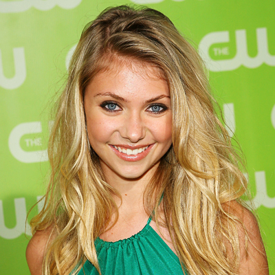
Today we started to get familiar with a program called in design on the macs.  this program is very similar to photoshop however it is better to work around text and article layout however photoshop is more for editind creating logos, pictures and such . however , indesign is used to create
we started of by making the simple  frame  and allocating where each part would go  and we filled it with random text just to get an idea of what it would look like
here is a screen shot showing you the basic layout plan with  labels to show you what goes where

Thursday, 3 November 2011

VOLT

I first had to come up with the font for my magazine. here are a few examples of the types of font i wanted to use. i had to make sure that it fit in with not only the genre of my magazine but also the target audience .

Out of all of these the one i like the best is the first because i think that it would be able to attract more people because of the fact that it is 3D similarly to the last one. however what i don't like about the last one is that it looks like something out of a circus and i don't think that it would  fit in as well as the first.
The 2nd one down is a bit to harsh and looks as if it wouldn't fit in with the type of audience i am trying to attract.
here is my text in photo shop below after i applied the gold glitter background i had to make extra layers and hide the bits of gold that i didn't want to be seen.The thing i like the most about the font is the fact that the pink and the glitter effect contrast very well
 As well as taking into count my own opinion a also carried out a questionair to see which on the four text choices people preffered here is a chart showing the risults. I asked 20 people. 


Wednesday, 2 November 2011

Target audience-
Gender: GIRLS
Age: 15-17
Income: receiving pocket money.
May have a part time job
Minimum of £20 a week.
Nationality: N/A
Psychographics
Outgoing: attend raves and parties
individual style including vintage clothing 90’s style
Downloading music /iTunes
Screen shot of  my tumblr showing interests
This lesson we did i kind of brain storm on our music magazine. We looked at all the different features and came up with the genre of music and such that we are  going to write about in our school magazine talked about how i wanted my magazine to be main steam chart music but only selected artists would be features because i am going for a particular target audience .We then talked about the cover image and what the person/people to look and dress like as well as the type of shot it would be.I wanted a shot from the hips and up.I also wanted it to be bright in colour to signify the young if targen audience.

Tuesday, 1 November 2011

DATA


When making any kind of product it is vital to carry out market research in order to get the best possible outcome.I chose to do a questionnaire to collect my data. In a questionnaire there are to types of questions:  
Quantitative: open question. For example what did you do on the weekend?

Qualitative: closed question. For example:what colour do you like best blue or             pink
Here is my questionnaire showing both types of questions to research the audience of my magazine.
-Gender:
Male [30%]     female [80%]
-How often do you buy magazines?
Regularly [19%]        sometimes [34%]         never [47%]
-Do you read any music magazines?
Yes [14%]    no[86%]
-What attracts you more to a magazine?
The mast head [10%]
Main image [52%]
Cover line [14%]
Smaller images [24%]


What are your 3 favourite artists? Eg: Jay-z

........................................................................

What features would you like to see in a music magazine? Please tick.
interview [32%]
Posters [3%]
New music [32%]
Reviews [6%]
Gossip [24%]
Other [3%]
Please list a few of your favourite clothing brands :

Do you illegally download music?
Yes [83%]         no [17%]

where do you listen to music? Please circle.
facebook [0%]
myspace[0%] 
itunes[37%]
youtube[61%]
Other [2%]
Where do you purchase your magazines?
Subscriptions to a magazine [8%]
In store [90%]
Online [2%]


After making 20 people complete this questionnaire, i then wanted to carryout a smaller questionnaire with fewer questions which would deal with questions which applied to the actual music magazine which talked more about the appearance and what the magazine would feature and so on. Therefore i chose 5 questions which included more visuals to let the people carrying out the questionnaire have more of an idea as to what my ideas were for the magazine.
Here is the second part of my questionnaire.

Add caption


Friday, 21 October 2011

Use of language in the music press

Here is a summery of the different types of language is found in music magazine . they vary according to the genre of the magazine .  the first was an article features in a RnB magazine and it was all about ray j and american artist.
the article was able to give me and insight into the artist and i was able to find out extra information which i didn't already know. however even though this is an article featured in a music magazine, it doesn't seem to talk much about music just more about gossip and scandals with other celebrities. there is a brief paragraph about the singer and his music.
''after catching wind of his hit sing 'one wish'''


 it talks about his past few years and what he has been doing . then it moves onto a Q and A it is here thats more forms of language is used. 
firstly there is a large amount of 'slang' or informal language and colloquialism used
here is an example of this 
''we just vibe 


more''...''Nah,I'm just 


playin''


i think that the reason this has been done is to relate to the target audience. probably being young people interested in him and for that reason they would be able to understand completely what it is that is being said.
this article offers personal identity as you may read it and either want to be like him or the complete opposite.
next this article gives many opinions however they are disguised as face facts because the don't include ''i think'' or ''some may say''.


i also noticed that there are many sale figures and facts in this article. the article seems be be advertising him as well as just having and interview.


Colloquialism: the use of informal everyday language Examples include: 'nuff said, init, ain't, coz, kool'


Informal/Slang: Wicked! the newz.


Metaphor: Describing something as something else. Examples include swag, Treasure chest. The effect of which associates those qualities with what you are describing.


Adjective: Describing a noun, wicked band, awesome gig.


Adverb: Describing a doing action (Verb), music playing loudly, audience roared excitedly.


Pun: Play on words - joke Tatt's all folks (Article about tattoo's)


Fact: How many fans there are, record sales, forthcoming releases.


Opinion: The atmosphere was electrifying, four stars out of five.

Thursday, 20 October 2011

music magazine

in todays lesson we analyzed 2 magazine covers  and their uses and gratifications . we also looked t the different target audiences and how their needs . this analysis will show how each code and convection fits in with the target audience and how the contrast each other 


MASTHEAD RESEARCH


In todays lesson we looked at different magazines and analyzed them , we focussed on the things that worked and looked good and the things that didn't quite work. Here is my analysis 

Tuesday, 27 September 2011

magazine content analysis


In today's lesson we looked at 2 types of magazines aimed at two different audiences one being NME , a music magazine aimed at males aged 16-23 into indie/rock music. We looked into the content of the magazine and how it links in with the the target audience .
We were asked to count up the amount of adverts, features etc. In the magazine and make a pie chart here is our results.
 Advertising reflects the hobbies and interests of the target audience for example they might advertise perfume in a women's fashion magazine .
many of the adverts featured in NME were full page ones however there was various adverts fit onto a double page. these adverts were for things such as gigs,album promo as well as phone adverts etc.
The editorial was found on one of the last pages near to the games and was just a thin column  however there was no letter pages .

 I was able to realise that the magazine doesn't just make a profit from selling the magazines alone but are payed to advertise ans when counting the adds up today in class i was able to see exactly how much the magazines  advertise.

My second magazine was aimed at a very different target audience, this being teen girls aged 12-15. Top of the Pops had much more adverts as you will see in the pie chart below , it was interesting to see the types of things being advertised (eg: makeup) nothing much to do with music but more to do with personal image and 'glamour’. The adverts in this magazine unlike the other one consisted of a lot more page adverts.


The editorial again was found at the back but this time taking up the whole last page. There was a letter page in this magazine; it took up a double page. Additionally in NME it had a lot more text then TOTP but that does link in with the target audience and being able to appeal to that specific audience

Sunday, 25 September 2011

plan

TH


E Here is a rough drawing of the magazine cover and contence page for my school magazine 'HEATwave'. I have chosen a text colour scheme of pink and dark blue, this fits in well with the target audience and the image that is going to be features are the following :
 
this is going to be featured on the left page of the contence as i feel as though the text will fit around this image well, along with images to go along side the main cover lines on the front cover .I want the text on the contence page to be like a typewriter (similar to this one).
 
we were then asked to come up with a few cover lines that would be featured on out magazine covers. We had to make sure that they fit in with our target audience and also offer them the four gratifications (bullit point there here ).I made up some which i am the going to choose from :
  • anti sewat-shop campaign goes to downings street
  • exclusive interveiw with alexa chung
  • ghetto glam photoshoot
  • get you quiz night tickets!
  • pictures from 2011 clothes show
  •  
 

front cover image

Heat wave magazine:


I had to come up with an idea of the type of image that i wanted on my front page , but also how it would link in with the cover lines etc. additionally making it a suitable image for the readers.

i decided that i was making a magazine for students at a fashion collage ,
first i did some research on an existing fashion college magazine called Pigeons and Peacocks which is made by people from the college. its based around fashion and culture and is even avalibe , for free , off the college website

'' Pigeons and Peacocks is still bringing you pages and pages of the best designers, photographers, illustrators and bigmouths with a lot to say.''

 I noticed that the magazine consisted of many bright and colourfull images that are very contiversial .
i wanted to make the same kinds of magazine for 6th form students of a fashion orientated college . As you can see below are some shots taken over the week end with i wanted to use as the front cover image of my magazine . the look i was going for was urban st style.


Overall i think the images turned out well. i edited them using a site called picnic  by changing the effect and contrast to get a sharper image. out off all four i then decided that i was going to use  the first image is not only do i like it best but i feel as though the text and other images would fit around it better .

Saturday, 17 September 2011

Mast Heads

In today's lesson , we were looking at the type of fonts that would be good for the mast head of our school magazines. We visited a site called dafont.com where it listed tons of different fonts which were ready to download.


After downloading the font we then opened it into photshop where we chose a magazine name and applied it to  the text.


 After making 4 layers with different fonts on we than played around with the colouring of the text so we ended up with 4 very different fonts . Here is the final product:


i didnt want the font to be too loud because it would take away from the image. additionaly i wanted it to be in colour but not too complex as it is just a sinple school magazine

Thursday, 15 September 2011

Audience Segmentation


This lesson we were talking about audience segmentation and how the media puts us into different social categories in order to sell a product . we looked at two different audience segmentation techniques. the first was called the NRS system (national relationship survey). we decided that out target audience  would  mainly consist of grade B-D (middle class - working class). The other classification was called the psychographics - this is putting people into groups according to their social value group :
we chose the contented conformers- wanting to be normal.

 Next we were asked to do a rough sketch of the front cover of  a school magazine. we highlighted the main areas of the front page this is the image to show you what he did ... 
our main audience were the 
pupils,parents,teachers and governors 


Wednesday, 14 September 2011

MAGAZINES

In class today we identified the key conventions that are on a magazine . Here is an example of this :
As you can see here I've labeled the main features of  vogue.com


The magazine offers the audience uses and gratification in the form of information about the new seasons fashion trends .The whole purpose of this magazine is to form a personal identity.This means viewers will read this magazine (eg: a fashion outfit page ) and take away what they have read ; this could be by them then purchasing something that they saw  on the page and liked . Finlay another function of this magazine is escapism , this is linked to the target audience (a woman 25+) and so it could be an attempt of then to escape and have a break from their surroundings whether it be looking after children or just work in general.

Tuesday, 13 September 2011

Introduction

Hi, I'm Zandile Lungah, 16 from London .my interests consist of: Music, Tumblr, singing and Photography. I am currently studying AS media and have set up this blog for media studies.

 The purpose of this blog is to show the build up to our media coursework, this involves planning process, photographs etc. which will lead up to as the making of the actual final piece.


First I wanted to gain the best understanding; I did this by visiting the exam board website and looking at the brief:


http://www.ocr.org.uk/download/kd/ocr_9646_kd_gce_spec.pdf

By doing this I was able to gain the best possible understanding of what I'm expected to do.


In today's lesson we looked at a variety of blogs. Three of which were previous students work and then a couple of our choice:


When I was doing this exercise it made me realise that you need to be able to have a good mix of text and images as well as other things such as videos and links to other sites.

Here are a few blogs that I think are good at doing this
- http://love-aesthetics.blogspot.com/
-http://clothesencounters.tumblr.com/
- http://thebanksyblog.blogspot.com/

next i wanted to give you and insight in the kinds of music i like a listen to so here is a playlist